Best Practices for Effective Website Design
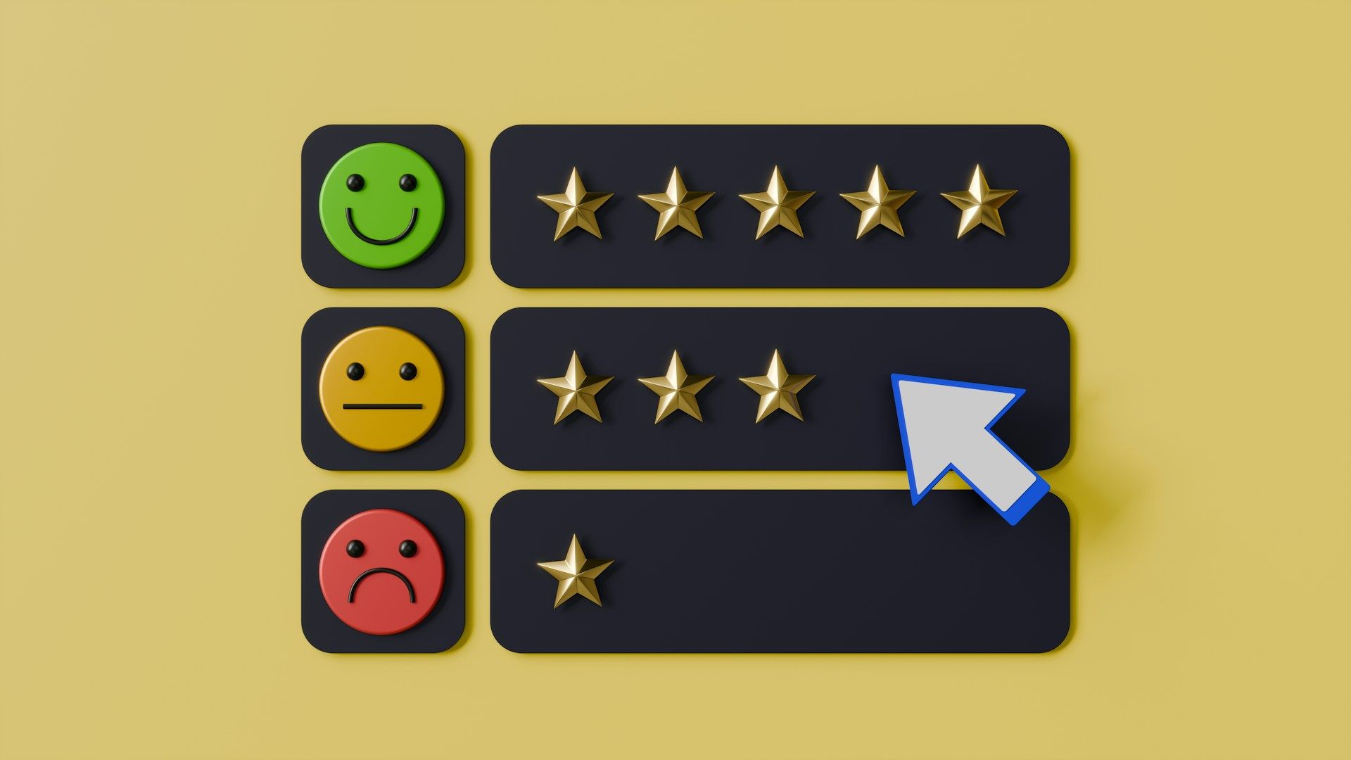
Creating an effective website involves more than just attractive visuals. It requires a thoughtful approach that ensures our website serves its purpose and meets the needs of our visitors. A well-designed website can improve user experience, increase engagement, and drive conversions, ultimately supporting our business goals.
One of the key components of effective website design is prioritizing user experience (UX). This means understanding how visitors interact with our site and making it as easy as possible for them to find the information they need. By focusing on UX, we create a smooth and enjoyable browsing experience, which can lead to higher satisfaction and repeat visits.
Another critical element is ensuring our site is mobile-responsive. With so many people accessing the web via smartphones and tablets, our site must look and function well on all devices. Likewise, the use of color and typography plays a significant role in how visitors perceive our site and interact with it. Thoughtful use of these design elements can improve readability and make our site more visually appealing. Finally, optimizing website speed and performance is essential. A slow website can frustrate users and lead to high bounce rates, so it's crucial to make sure our site loads quickly and runs efficiently.
Prioritizing User Experience (UX)
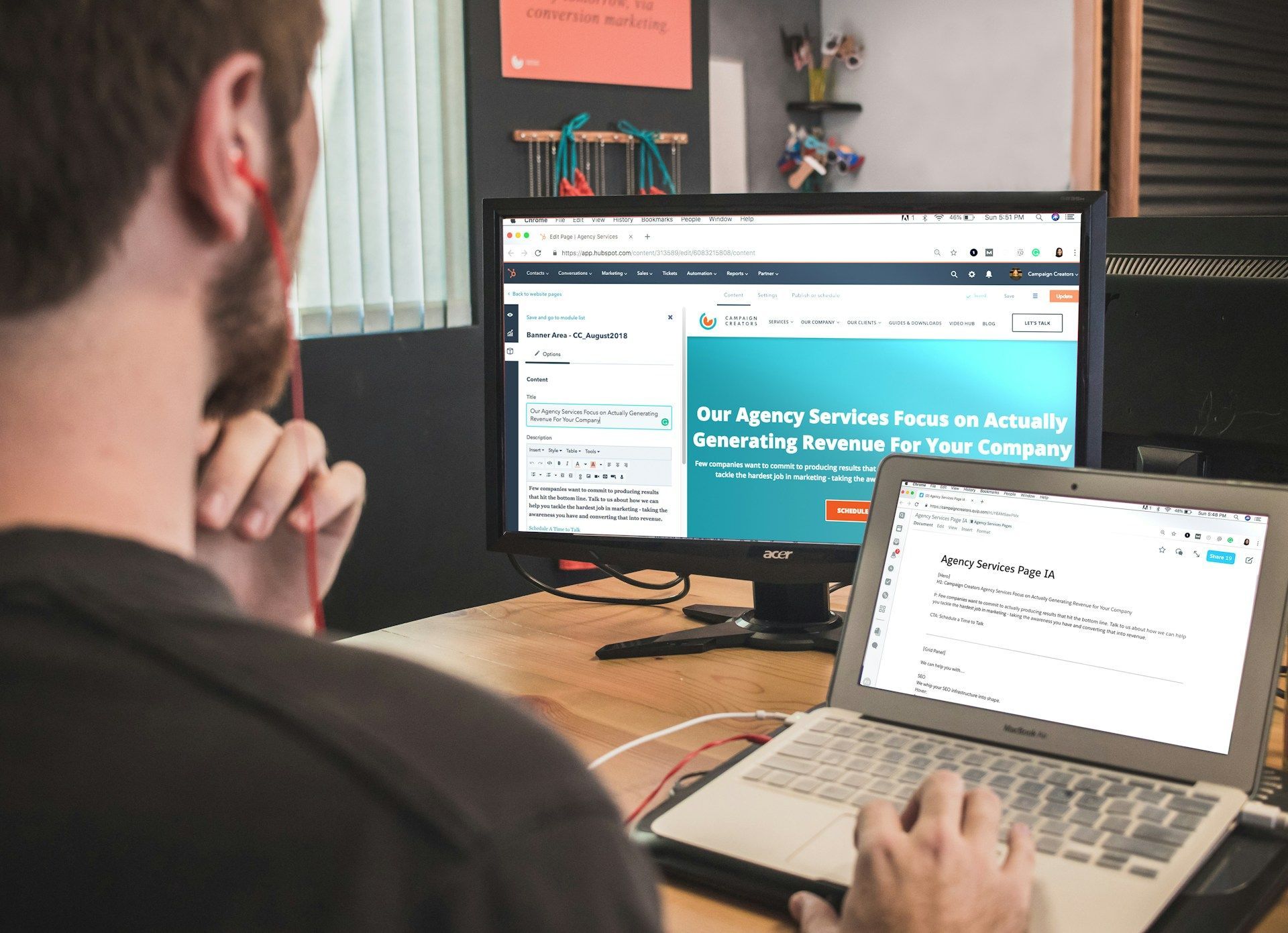
Prioritizing user experience (UX) means putting ourselves in our visitors' shoes and making our website as easy to use as possible. We start by designing a clear and intuitive navigation system. This helps our visitors find what they are looking for quickly and without frustration. A well-organized site structure with straightforward menus and labels can make a big difference in how users interact with our site.
It's also important to pay attention to the overall layout and design elements. We use whitespace effectively to avoid clutter and make the content easier to digest. High-quality images and clear calls-to-action (CTAs) guide users through the site seamlessly. Additionally, ensuring all our links work and our forms are easy to fill out contributes to a smooth user experience. By focusing on these details, we create a website that not only looks good but also serves its purpose effectively.
Mobile-Responsive Design Essentials
A mobile-responsive design ensures that our website looks and functions well on all devices, including smartphones and tablets. To achieve this, we use a responsive design framework that automatically adjusts the layout based on the screen size. This means our text, images, and buttons will resize and rearrange to fit any screen, providing a consistent user experience.
Testing our site on different devices is an essential step in this process. We check how our site performs on various smartphones and tablets to identify and fix any issues. Making sure that our site’s touch elements, like buttons and links, are large enough to tap accurately is crucial. Additionally, we should avoid using Flash and other technologies that may not be supported on all devices. By prioritizing mobile responsiveness, we ensure that all visitors, regardless of device, can access and enjoy our website.
Effective Use of Color and Typography
Color and typography play crucial roles in how visitors perceive and interact with our website. Choosing the right colors can evoke emotions and create a cohesive brand identity. We start by selecting a primary color that represents our brand and then complement it with secondary colors for contrast and emphasis. Using colors intentionally helps guide users' attention to important elements like calls-to-action or headings.
Typography is equally important for readability and aesthetic appeal. We choose fonts that are easy to read and consistent with our brand's voice. Avoiding overly decorative fonts ensures text remains legible on all devices. Using a hierarchy for typography—such as larger, bold fonts for headings and smaller fonts for body text—helps break up content and make it more digestible. Proper line spacing and paragraph breaks also improve readability, ensuring visitors can easily process the information presented.
Optimizing Website Speed and Performance
Website speed and performance are critical factors in user satisfaction and SEO. A slow-loading site can frustrate visitors and lead to a higher bounce rate. Speeding up our website requires several technical optimizations. First, we compress and optimize images to reduce load times. Tools like image compression plugins can help lower file sizes without sacrificing quality.
Another essential step is to minimize code. Removing unnecessary scripts and combining CSS files can improve website speed. Enabling browser caching allows users to store parts of the site in their browser, reducing load times for repeat visits. Additionally, we should consider using a reliable hosting provider and a content delivery network (CDN) to distribute our website content more efficiently. Focusing on speed and performance ensures a smooth experience for our visitors while improving our search engine rankings.
Conclusion
An effective website design is crucial for attracting and retaining visitors. Prioritizing user experience ensures our site is easy to navigate and enjoyable to use. Mobile-responsive design makes sure our site looks great and functions well on any device. Thoughtful use of color and typography enhances readability and guides users' attention. Finally, optimizing website speed and performance keeps our site running smoothly and keeps visitors engaged.
If you’re looking to create a high-performing website that impresses users and meets your business goals, Cre8 My Site is here to help. We specialize in
affordable web design and digital marketing solutions tailored to your needs. Contact Cre8 My Site today to start building a website that stands out and performs at its best.


Small Businesses Are Our Passion
Build a professional digital presence that your company can be proud of with Cre8 My Site's Fully Managed Plans. They will help create an amazing website for your business with exceptional support. Choose a plan to cover your business needs.


Contact Details
Email: hello@cre8mysite.com
Business Hours
Monday-Friday - 8:00am-5:00pm
Saturday - Appointment Only
Sunday - Closed